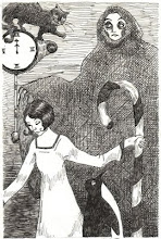
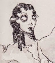
The following posts are a much boozier, artier, gorier version of the typical "What I did with my summer vacation" essay. At left is a picture I drew at Jazz & Sketch last Thursday at the Society of Illustrators (two minute pose, lovely model). Here at The Cabinet, we refuse to be either bored or idle in this City of our Dreams!
Showing posts with label fine art. Show all posts
Monday, June 27, 2011
What Caviglia Did On Her Summer Vacation!: An Introduction
The following posts are a much boozier, artier, gorier version of the typical "What I did with my summer vacation" essay. At left is a picture I drew at Jazz & Sketch last Thursday at the Society of Illustrators (two minute pose, lovely model). Here at The Cabinet, we refuse to be either bored or idle in this City of our Dreams!
Friday, June 17, 2011
The Crest Fest Art Show
This weekend sees the opening of the Crest Hardware Art Show in Williamsburg. Sponsored by and situated in the Crest Hardware store, the show features works constructed from items commonly found in - you guessed it! - a hardware store.The show kicks off tomorrow with the Crest Fest which will feature bands, DJs, beer and a sale of works by local artists. The proceeds will benefit the City Reliquary.
See at left this charming octopus made by Jude Ferencz. When I went and looked up the photo credit, I was happy to see the picture was taken by friend of The Cabinet, Theo Coloumbe of the Brooklyn Photo Studio. You can see more works from the exhibit here.
They are located here. In fact, it would really be beyond convenient to stop by this fest and then just run down the block and see a few offerings in The Brick's Comic Book Theater Festival (which I can't link to directly because of some egregious Flash usage, so facebook it is).
Tuesday, June 14, 2011
Other Cabinets of Curiosities
A little over a week ago, the Inamorato and I made our way over to Proteus Gowanus which includes within its walls the Observatory (a gallery space) and the Morbid Anatomy Library. The library has a nice little collection (the emphasis on "little"), but didn't seem miles more thrilling than what I would expect to find in someone's home.In the Observatory, I was happy to catch an alchemy themed group show (Curses! It just closed yesterday.). It was, again, small, but well curated (by Pam Grossman, author of Phantasmaphile), with pieces from the always prolific Molly Crabapple of Dr. Sketchy's fame, Ann McCoy (whose work I really love), and a pair of etchings by Ukrainian artist Marina Korenfeld - who is new to me and was glad to find out about (at left, her etching Abraxas).
Over all, though, the artwork in the Obsevatory aside, excitement felt a little thin on the ground. When I picture what I want Proteus Gowanus to look like in my head, the images are far more dense, grand and exciting.
Remember that blog post of mine from way back in 2009 in which I wrote about thoughts of Victorian interior decoration, and about how taxidermy frightens me and about how I'm frightened of a mad, lonely, little old lady-hood? Well, many, many things have changed since that post and I am altogether one hundred percent aesthetically attuned with the person with whom I share my domicile. I don't think there's anyone in this house who would get particularly upset by a taxidermied crocodile, say (except, of course, with worrying about where it would go). What I really need are picture frames. I mean, I now live in a house where the biggest problems are all book and paper related, which is how it should be. Or maybe we have possibly too many wigs. I am certain we will keep each other from any sort of Collyer-dom. If there are any exciting design additions to Cabinet Headquarters, I will be sure to share them.
A couple of weeks ago, the Times did a piece on a loft in Williamsburg that has been called by its owners, The House of Collection, and it's just lovely. Unlike some of the homes featured a couple of years ago, Paige Stevenson and Ahnika Meyer's loft looks airy and sunny and livable. And I am heartily jealous, though maybe I shouldn't be because the amount of work put into it over the past three decades is more than apparent.
I think it's clear that I like the spaces around me to be dense and busy. I'm a maximalist all the way, and one of the hardest things for me at my day job are the empty gray walls. I began this blog with the idea of it being a modern, digital Cabinet of Curiosities, and as I near my 400th post, I thought it would be a good idea to re-examine that mission. And upon reexamination, I think it still explains better than anything what I am striving to do here. The world, both past and present is full of so much interest and excitement that each of us are lucky if we get the chance to see or experience even the tiniest sliver of it.
Photo at right via nytimes.com
Monday, May 30, 2011
RIP Leonora Carrington

"I didn’t have time to be anyone’s muse… I was too busy rebelling against my family and learning to be an artist." - Leonora Carrington, 1983But still, in the very first sentence of her New York Times obit, her relationship with Max Ernst is referenced. I have a feeling that might have rankled, though she admitted her debt to him, often. She was a wonderful painter who lived a long, productive and interesting life.
Like all artists (particularly of the female variety) she was remarkably self determined. Born into an upper class English family, running off to Paris to join the Surrealists wasn't precisely what her parents had in mind for her, to say the least. She ran off with the much older Ernst when she was about 20 and painted and wrote. There's a great anecdote about Jean Miro handing her some money and telling her to go get some cigarettes, which she essentially threw back in his face.
She first came to my attention because of her obsessions with the occult, alchemy and myth. She wrote as well as painted and I think I first encountered her work in an anthology of fantasy written by women. Like Ernst, she was a surrealist down to her very marrow. Her work is strange and autobiographical, oddly matter of fact in tone.
As for most everyone of her generation, the war was the defining event in her life. Ernst was imprisoned by the Nazis (but arrested first by the French Vichy government I think it's worth noting), and Leonora fled to Spain. She suffered a breakdown and her parents had her committed to a horrific asylum. I have no idea how apocryphal this is, but I read that she was rescued from the madhouse by her former Nanny, who arrived in a submarine. She eventually made her way to Mexico where she spent most of the remainder of her life. She and Ernst, both damaged by the war, never reconnected.
In addition to her painting and writing, she also designed for the theater. The picture above shows costumes she created for a show directed by Chilean director and filmmaker, Alejandro Jodorowsky, who she mentored. Her life was long and interesting and productive but, naturally, I suppose, most people want to hear about the short years with the Surrealists in Paris. It was a time of such outrageous creativity, one just longs to have been there. At least I do - in my time machine wish list, Paris between the wars ranks high.
Leonora Carrington died this past week at the age of 94. In an odd way, I wish she could come back, as she is a painter uniquely suited, I believe, to showing us what the afterlife looks like.
Sunday, May 29, 2011
Friday, May 20, 2011
lluminating Fashion: The Morgan Library
I often think about the semiotics of Fashion and Clothing (not exactly the same thing), so I'm champing at the bit to see Illuminating Fashion: Dress in the Art of Medieval France and the Netherlands, an exhibit at The Morgan Library which opens today. In it, they purport to chart the evolution of fashion in (of course) France during the Medieval Era through illuminated manuscript illustrations. So rarely do so many of my obsessions come together in one exhibition! Illuminated manuscripts are some of the earliest European illustrated books, mostly rendered in egg tempera, one of the hardiest mediums known to man. The surviving pictures are still as bright and fresh as they day they were painted.
For many hundreds of years, one was able to tell precisely where a person fell on the social scale just by glancing at them. Strict sumptuary laws prevented any but the entrenched nobility from wearing certain fabrics and colors and styles. It wasn't until the rise of the prosperous merchant class in the Renaissance that these laws began to be stripped away. Nearly all of what we know about what people wore in pre-modern times is from art as textiles rarely survive so long. Because of this, our understanding of undergarments is minimal. Fashions moved slowly in a time before travel was common and before Mr. Gutenberg invented his remarkable press. Great world events influenced dress remarkably - the Crusades and the opening of the East brought silks and velvets and brocade to Europe, and the shapes of clothing changed as well. The corset became de rigueur in the 14th century. So, needless to say, I'm looking forward to seeing what the curators of this exhibition have put together.
For information about visiting The Morgan Library and Museum, go here. The exhibition runs from today through September 14th.
Wednesday, May 18, 2011
Lori Nix: Unnatural History and Other Worlds
In talking about photography, I most often say that I like pictures of people. And mostly, the same goes for paintings. But, as in most things, there are oftentimes exceptions and the photographs of Lori Nix are a huge one. I was first introduced to her work via a facebook link posted by the always interesting Artistic Director of Art House. I was instantly intrigued and spent a lot of time with them.

There aren't any people in them at all, and Nix has said in interviews that one of her great influences are the Hudson River School of landscape painters and, in a way, it shows. When I first saw her photographs I couldn't quite figure out what I was looking at. They were from her series "The City", in which we see strange, long abandoned urban scenes in which trees and other foliage have grown back. I didn't understand where they were taken, or how she found these remarkable scenes to photograph.

Lori Nix's wonderful settings aren't found, they are made. She creates them herself, on tabletops. She then lights them and doesn't use any digital manipulation at all. They are perfect and melancholy and exquisite. There are landscapes and interiors and insects. She shares some of my personal obsessions, as do many of the artists I feature here - the conflict between the natural world and the structures of men; museums and toy theaters of all sorts.

I both want to know how she makes everything and I don't. Am I the only one who wants her to branch out into animation? Maybe I'm wrong, maybe the power of her images comes from their silence and stillness. Qualities rare indeed in our noisy and over-stimulated world.
All photographs are the property of Lori Nix. If you are interested in purchasing her work, contact ClampArt. (Pssst: Wealthy admirers, I have birthday coming up, you know)

There aren't any people in them at all, and Nix has said in interviews that one of her great influences are the Hudson River School of landscape painters and, in a way, it shows. When I first saw her photographs I couldn't quite figure out what I was looking at. They were from her series "The City", in which we see strange, long abandoned urban scenes in which trees and other foliage have grown back. I didn't understand where they were taken, or how she found these remarkable scenes to photograph.

Lori Nix's wonderful settings aren't found, they are made. She creates them herself, on tabletops. She then lights them and doesn't use any digital manipulation at all. They are perfect and melancholy and exquisite. There are landscapes and interiors and insects. She shares some of my personal obsessions, as do many of the artists I feature here - the conflict between the natural world and the structures of men; museums and toy theaters of all sorts.

I both want to know how she makes everything and I don't. Am I the only one who wants her to branch out into animation? Maybe I'm wrong, maybe the power of her images comes from their silence and stillness. Qualities rare indeed in our noisy and over-stimulated world.
All photographs are the property of Lori Nix. If you are interested in purchasing her work, contact ClampArt. (Pssst: Wealthy admirers, I have birthday coming up, you know)
Friday, May 13, 2011
Alfred Kubin: Symbolist Artist and Proto-Surrealist
Alfred Kubin, born in 1877, was a strange, reclusive and emotionally fragile artist and illustrator. When he was about 20, he attempted suicide on his mother's grave and suffered a series of breakdowns. It was around this time that he discovered the work of Odilon Redon, Edvard Munch and Max Klinger and was profoundly influenced by them. Previously apprenticed to a successful landscape photographer, he moved into working in mostly pen and ink and lithography and began traveling in German avant-gard circles.His work is grotesque and nightmarish, and feels profoundly Freudian (lots of scary vaginas). One the war started he pretty much became a recluse, and remained one for the rest of his life, holing up in a 12th century castle in Austria. His work was declared "degenerate" and "decadent" by the Nazis (if one wishes to be strictly truthful, he was both. The question is really whether you have a problem with it or not), but they pretty much left him alone. Unsurprisingly, he illustrated work by Poe, E.T.A. Hoffman and Dostoyevsky.
He also wrote a couple of strange dystopian novels, all of which are sadly out of print in English (unless you have a Kindle!). It's all terribly evocative. I decided to feature him here because I found that once I started looking at his pictures, I simply could not get them out of my head. I haven't read his famous novel, The Other Side, but I've heard very good things. One wonders what went on in his mind as he worked alone in his castle. One looks at his work and shudders.
Wednesday, May 11, 2011
Anthropomorphica: Doll Parts
Originating in Edinburgh, the gifted proprietress of Anthropomorphica creates strange and wonderful dolls, names them, writes little narratives, takes their pictures and posts them on her blog. Her work is exquisite, gothic, charming. Sometimes she puts one of her dolls up for adoption (via her Etsy store).
She also sometimes features dolls made by other artists. It's a world I didn't know existed, with beautifully crafted figures made of clay and papier-mâché and paint and felt and bone. It led me through link after link of invented worlds and finely crafted beings. I love how so much of it is tied to narrative, and one certainly assumes that they do indeed come to life after the lights are put out.
Please look at:
Anthropomorphica (who, needless to say, owns the photo above)
Monday, May 9, 2011
Castles and 18th Century Theatrical Design: Whee!
One day last week I had a few hours to kill between work and drawing at the Society of Illustrators, so I walked a bit in Central Park and wandered into The Met.Whenever I visit this most glorious of New York City museums, I always start by seeing what they have up in the constantly rotating Drawing and Print Gallery on the 2nd floor. The current exhibit, which is pulled from the permanent collection, is pretty fantabulous. They've pulled out all the big guns with Albrecht Dürer, Rembrandt and William Blake well represented. I remember being twelve or thirteen and staring at the famous self-portrait Dürer drew when he was thirteen and being completely upset that I wasn't as good. Yes, for what it's worth, even when I was a child I compared myself with the Renaissance greats. One of my favorites is included, "The Sea Monster" (at left). I love the tortoise shell being used as a shield and the romantic castle of my dreams situated in the landscape.
Also on display, are a number of 18th and 19th century stage designs. Most are ink and watercolor. There are some glorious ones for a mid-19th century Magic Flute, and an 18th century design (at right) for a sadly unidentified production drawn by Johann Heinrich Ramberg that made me want to jump into my trusty (imaginary) time machine and create something in his glorious, repurposed space. There are more - beautiful Italian watercolors and chalk drawings and an interior of The Met Opera House from 1884 that put the currently used software to shame. Why is it that so many useful modern instruments also neglect to be beautiful?
The current exhibit is up through June 12.
I also made a quick sweep through the Alexander McQueen exhibit, and it even more wonderful than hoped. More on that later!
Wednesday, May 4, 2011
Alexander McQueen: Savage Beauty

Today, the long anticipated Alexander McQueen exhibit opens at the Costume Institute at the Metropolitan Museum of Art. The designer committed suicide in 2010. It's always a tragedy when a beloved artist leaves this mortal coil in his prime, but the thought of him being so miserable whilst being so brilliant and renowned is just heartbreaking.
His work was witty and achingly beautiful. The picture above is part of a Grace Coddington styled spread in Vogue featuring model Coco Rocha (among others) wearing his creations. Some samplings from the exhibit below. I'm likely going to go some Friday first thing in the morning, sketchbook firmly in hand, to beat the crowds.


Particularly for those of my readers who are theater folk with little knowledge of fashion: his runway shows were truly beautiful living and ephemeral pieces of art. See this video montage below, courtesy The Met and Alexander McQueen's estate:
Tuesday, April 26, 2011
Elizabeth McGrath: Everything That Creeps
I'm not sure where I first came across the work of artist Elizabeth McGrath, but I know I wasn't living in the current Cabinet headquarters, so it had to have been more than five years ago. I also own a book of her art, Everything That Creeps, and I have no idea where it came from. Well, things accumulate.McGrath is a part of the punk-pop-goth-fairy tale aesthetic that is just busting out of Los Angeles from seemingly all directions. She constructs meticulously put together sculptures which often include small dioramas embedded somewhere inside them, using found objects, doll furniture and taxidermy. Her more recent work has a cleaner, more nursery rhyme feel, while her earlier work is much, much, much darker.
I always admire people who know how to make things, as my hands are clumsy and I'm no good at it at all.
See the pig below:

And then look and see what's embedded in its belly!

See the pig below:

And then look and see what's embedded in its belly!

Her work is strange and beautiful and one gets the pervasive feeling one has entered an other-worldly dime museum. As if unseen wonders and horrors are being presented to us.
McGrath has some larger scale work too, of which I am less fond. I have a feeling, that like myself, she is a miniturist at heart. She's someone with which I would love to collaborate, actually, as I feel the people (or beings) in her work are just crying out for stories.
For now, she's on my list of artists whose work I'd like to own if I can ever afford art. I have to say, I'm a little transfixed by her earlier, slightly more diabolical work, which somehow really inspires me. Taxidermy (of all things) is having a moment, isn't it? I've talked about this here before about my fear of maggots and arsenic, but the fascination still lingers. And there this, a class on mummification coming up. I'm sorely tempted.Wednesday, April 20, 2011
Cinemagraphs by Jamie Beck
The animated gif has been around for as long as the internet has existed (and longer still). They are easily created little graphics that can capture a piece of a television show:

Or make a point in a discussion:

Or are just really funny:

But thus far, they haven't really been created for the purpose of art. Books and magazines and newspapers printed on actual paper are soon to be done for. Soon, only the poor will do something so wasteful and ridiculous as not read off a screen. And then, I assume, the usual switch will happen. Paper will be rare and pricy and the rich will covet it. But, soon, magazines and books will mostly be digital. I don't think this has been thought through much in terms of content, and the capabilities digital files possess. That will come, I am sure.

For those of my readers who have gotten tired of the decidedly (but wholly unintentional) fashionable bent The Cabinet has taken over the past week or so, here is another shot by Beck of a gorgeous old timey barber shop at 71st and Lexington that looks like something one can only visit via time machine:


Or make a point in a discussion:

Or are just really funny:

But thus far, they haven't really been created for the purpose of art. Books and magazines and newspapers printed on actual paper are soon to be done for. Soon, only the poor will do something so wasteful and ridiculous as not read off a screen. And then, I assume, the usual switch will happen. Paper will be rare and pricy and the rich will covet it. But, soon, magazines and books will mostly be digital. I don't think this has been thought through much in terms of content, and the capabilities digital files possess. That will come, I am sure.
Photographer Jamie Beck has begun creating what she's calling cinemagraphs. Animated gifs that are using technology to create moody little moving photographs. They're interstitial nature. They are neither film or photo. Below, she collaborated with model Coco Rocha in these lovely shots taken in Rocha's apartment. It's an interesting experiment, and I look forward to seeing where it will lead.

For those of my readers who have gotten tired of the decidedly (but wholly unintentional) fashionable bent The Cabinet has taken over the past week or so, here is another shot by Beck of a gorgeous old timey barber shop at 71st and Lexington that looks like something one can only visit via time machine:

The four above gifs are via Jamie Beck's blog, From Me To You, and the images belong to her.
Thursday, April 7, 2011
R. Crumb Does Not Make Mistakes (With His Pen)
The second stop on our Saturday gallery hopping odyssey was at one of my usual haunts: The Society of Illustrators on East 63rd Street. It's one of those true New York treasures that not that many people seem to know about. Their gallery shows are always well curated and interesting - and free of charge. Each Tuesday and Thursday the have their Jazz & Sketch nights. They have live music, a bar and models. I've had the pleasure of drawing such luminaries as World Famous *Bob*, Amber Ray and Miss Saturn. And there's all kinds of thrilling art everywhere.Their current exhibit, up only through April 30 is R. Crumb: Lines Drawn on Paper. Curated by the editor of the Blab! anthology, Monte Beauchamp, it focuses on work from the collection of Eric Sack, most of it from the late '60s through the early '70s. R. Crumb is a monster and a genius, and from the interviews I've seen him give, he seems like an all right person. He's funny and profane and wears his problems and obsessions on his sleeve. Like Dennis Potter, one of my great influences, it's hard to get all that upset at him for his failings, for he is so achingly aware of them.
There really is something to offend and delight most people, but after looking at the 90 or so works contained in the exhibition, something began to dawn on me. I've seen a lot of original comic drawings, and I work in pen and ink fairly often. I've written about it here, about how it is an unforgiving medium. Usually, when you see the original pages from comics, you see corrections. White out, bits pasted in, etc. Particularly as few (if any) of these artists ever anticipated the originals being seen. In the elaborate and beautifully drawn works in this exhibit I saw very, very few corrections.
Robert Crumb is an unerring draftsman and an artist of true brilliance. I mean, he can draw. He can really, really draw. His output is truly fearsome and all of it is all kind of perfect. You can't see one of his drawings without knowing who created it. Only someone trained in a Renaissance workshop or a single-minded obsessive could get this good.

Robert Crumb is an unerring draftsman and an artist of true brilliance. I mean, he can draw. He can really, really draw. His output is truly fearsome and all of it is all kind of perfect. You can't see one of his drawings without knowing who created it. Only someone trained in a Renaissance workshop or a single-minded obsessive could get this good.
So, yeah. Go. It's also fun to be in a gallery full of giggling people. My only criticism is that It would have been lovely to see more of his recent work: the Heroes of the Blues series or something from his Old Testament adaptation. These are just quibbles, though.
Find information and hours here. And it's FREE.
Wednesday, April 6, 2011
Mark Ryden's Strange World

I really can't get excited enough about the renewed interest in representational art, and painting in particular. I have a real fondness for contemporary painters who use meticulous, classic techniques to create their work. My beloved Walton Ford, of course, springs immediately to mind, with his enormous and beautiful works on paper. But among the painters whose work I would go to great lengths to have hanging on my apartment walls, Mark Ryden's would be high on that list.
I love his strange cartoon-like world, perfectly realized using old master techniques. Big eyed, almost Margaret Keane looking children - often crying tears of blood, animals, strange symbols, trees, meat, Catholic iconography, celebrities and, often, Abraham Lincoln. It's a fascinating and modern stew.
He hails from the West Coast (Oregon) but has lived and worked in California all his adult life. He's not a native like Tim Burton or Francesca Lia Block, but he's still a part of this odd Los Angeles sensibility they all seem to share. He's one of a few modern painters (Elizabeth Peyton is one) who seem to understand the Celebrities don't matter, but Celebrity does. That these people on television and in magazines are as much a part of our national iconography (for good or ill) as Santa Claus or Jesus or the Hall of Presidents. These young artists are finishing the work that Warhol started. 
But Warhol missed the last twenty-five years. He really had no idea what was coming. Our culture seems to be collapsing in on itself, with Snookie speaking at universities and kids just wanting to be famous, rather than wanting to make something or do something or to be President. But, who am I to throw stones? I don't want to be president either. But I am eternally interested in artists who are really trying to make sense of it all. Mark Ryden and Mark Leyner. Cintra Wilson. Others. We are living in very strange and worrying times here in the post-Warhol, post-industrial present.

But Warhol missed the last twenty-five years. He really had no idea what was coming. Our culture seems to be collapsing in on itself, with Snookie speaking at universities and kids just wanting to be famous, rather than wanting to make something or do something or to be President. But, who am I to throw stones? I don't want to be president either. But I am eternally interested in artists who are really trying to make sense of it all. Mark Ryden and Mark Leyner. Cintra Wilson. Others. We are living in very strange and worrying times here in the post-Warhol, post-industrial present.
And we need art that will reflect it. It's such a weird thing. After seeing the Whitney exhibit in which they put Edward Hopper in the context of the times he lived in, one wonders what the same sort of exhibit would look like for contemporary artists a hundred years from now. The dawn of the twentieth century looks so optimistic in retrospect, and the dawn of the 21st so much less so.
Tuesday, April 5, 2011
Someone Chromed Andy

Andy Warhol, rendered in chrome in Union Square. It's so completely tacky, I think he would have loved it. It was created by sculptor Rob Pruitt and will be up through October.
Modern Life: Edward Hopper and His Time

Modern Life: Edward Hopper and His Time is up at The Whitney only through the 10th, so run people, run!
Inamorato and I finally got uptown to see it this past Saturday. I love Edward Hopper. I've used the sentence, "I want it to look like a Hopper painting" when talking to lighting and costume designers far too often. I've featured him briefly in this gathering of pixels before. Jewel tones, saturated colors, warm, yet theatrical lighting. Beautiful. Some people might remember the battle of the beige sweater. Twelve or so years ago I collaborated on the stage adaptation of Cigarette Waltz by Philip-Dimitri Galas (under the title Angry Little People). My collaborator wore a green Mad Men era dress that originally belonged to my mother, and she was admittedly, maybe a little too young for the role. So she added a beige sweater to her costume to make it just a little less cute. I seem to remember endless circular arguments about how that damn sweater was messing with my Hopper-like pallet. But the beige sweater remained.
Back to the Whitney. Like I said, I'm a little obsessed with Hopper and my only beef with the exhibit is that I wanted a little more Hopper in my Hopper exhibit. Which is likely more my problem than the Whitney's, as the exhibit as whole was extremely enjoyable. They put Hopper and his work in the context of the times he painted in (most famously between the wars, though his career began in the aughts and lasted through the sixties), the painters who came before him (Ashcan) and those who painted along side him.
Most exciting to me of the non-Hopper work were the early 20th century paintings of the insides of theaters, including the one by William Glackens at left of Hammerstein's Roof Garden and one of an unidentified performer lit only by footlights. As one enters the exhibit, one is greeted by a thrilling 1921 film of skyscrapers, hundreds of identically dressed men in hats and ties disembarking from the Staten Island Ferry, downtown Manhattan shot from way up high, the people all looking like Harry Lime's ants. It truly was The Machine Age and it looked just like Frans Masereel's The City.
I looked at all this work from early in the last century and it finally dawned on me: the Twentieth Century is truly over. You know how the feel of the previous century kind of sticks around for a few years? Kind of like a hangover. How the 20th century didn't really start until the teens? Well, the 20th Century hangover has ended. A new era is upon us. The Machine Age, like the Age of Reason and the Iron age before it has been consigned to the dust pile. All hail the glorious future!
Monday, April 4, 2011
Sex! (Museum of, I mean)
Let's see what google search terms bring people here!The last step of me and my inamorato's gallery hopping odyssey this past Saturday landed us at The Museum of Sex where we viewed (after elbowing our way though the lobby gift shop, jam packed with tourists) two exhibits: The Nudie Artist: Burlesque Revealed and Comics Stripped. I mostly want to talk about Comics Stripped, so more about the Burley-Q exhibit in a moment.
Their comics exhibit is curated by Craig Yoe, an extremely interesting and knowledgeable personage. He's a former Creative Director of The Muppets and over the years has had his fingers in many, many comics and animation pies. He now runs his own design studio and occasionally writes books on the history of comics. Most recently, Secret Identity: The Fetish Art of Superman's Co-Creator Joe Shuster (with an introduction penned by Stan Lee). I was lucky enough to be at the Dr. Sketchy's event promoting the release of the book about a year and a half ago. You can find some of the pictures I drew that day (of the lovely Darenzia) here.
Yoe charts the history of dirty comics from the Tijuana bibles of the '20s and '30s, through the cartoons that appeared in Playboy in the '50s and early '60s through the work of Italian comic artist Guido Crepax (who also has a Louise Brooks inspired book) on to R. Crumb (more about him this week, too!) and on to modern innovators like Alison Bechdel. The show is comprehensive and well curated and well worth a look.
Sadly, I can't really say the same for The Nudie Artist. I think this is where the Museum of Sex's for-profit status really shows. I have a feeling they don't have the access or resources to put together an exhibit worthy of the subject matter (I think they need curators with the access that someone like Yoe brings to the table). The exhibit mostly consists of a gallery of photographs taken by Leland Bobbé of current burlesque performers which are, you know, fine. But not all that thrilling, especially considering the gigantic and interesting personalities of his subjects. An odd thing: I liked his photographs far more at a smaller size when I was looking at the on line gallery on his web site.
The Nudie Artist also included a room of drawings by sketch artist/illustrator Luma Rouge. I like her work very much, but I thought the exhibit as a whole could have benefited from far more (ironically) variety. It's such a rich and interesting subject matter and with all this renewed interest in burlesque past and present there is so much more that could have been done. I wonder if anyone contacted Liz Goldwyn who has been collecting vintage burlesque costumes for years, or thought about raiding some photo and newspaper archives. There was a small section that did look at Burlesque as it existed in the earlier part of the 20th century, with some (few) photos and a costume that had been worn by Blaze Starr, and to my mind the most exciting thing in the exhibit, a recreation (or preservation - I'm not certain) of Mara Gaye's vanity: but I wanted more, dammit, more!
The main problem with this Museum is likely its for-profit status. It has to pay for itself somehow, so far more attention and care seem to have been taken over the gift shop and the cafe. I don't know that its mission is particularly scholarly, but I would be curious to find out exactly what its mission is. The comics exhibit was extremely well curated and thoughtful, but the people wandering around the Nudie Show exhibit didn't really know what they were looking at. If you didn't know already, you would not learn who Jo Boobs or Dirty Martini are, you would just know that their pictures are on the wall. Which is really kind of a shame.
Friday, April 1, 2011
Painters X 10: The TNC Gallery

The other day, inamorato and I swung by Theater For the New City on the business of dropping off postcards, and were instantly entranced by the gallery show, Painters X 10. The subtitle of the exhibition is "Painting That Spits, Drips, Twists, Amuses, Disturbs, Soothes". The show features ten painters: Velveeta Heartbreak, Liam O’Brien, Scott Geyer, Vladimir Ginzburg, Daniel Caspera, Darlin Formeta, Sean Noyce, Ian McGillivray, Jeffrey Faerber and Lawrence Quigley.
I particularly liked the work shown by Darlin Frometa (above, left), who showed paintings from a series entitled "Big Men In Dresses Fighting Superstition". The work varied greatly in terms of subject matter and technique, with a moody, very traditional oil painting of a ferris wheel up next to a riotous multimedia pop inflected explosion of unlikely juxtapositions. According to the materials available, this is a renewal of sorts for the gallery at TNC. They have a new curator (Peter J. Ketchum) and with him, a commitment to featuring underrepresented artists.
Which, great. But. Sigh.
First things first. Theater For The New City was founded 40 years ago and has been a downtown cultural institution ever since. They founded the Village Halloween Parade and have featured artists of all stripes in and on their stages. It's simply the most inclusive of places imaginable.
This is why, though I enjoyed much of the work currently on TNC's walls, I walked away disappointed. You see, all the painters are men. The show features painters exclusively, all with widely varying technique and subject matters. I just find it hard to believe that under an umbrella so potentially wide ranging, Mr. Ketchum was unable to find a single woman painter to feature. It's just not good enough, and particularly surprising in a place such as TNC. This is a big enough deal that if Mr. Ketchum does not know of any female painters, perhaps he should enlist a colleague or two to point him towards one of the many female painters who could benefit from a showing at TNC.
The next show is going to feature LGBT artists. There better be lesbians, or I'll be awfully cranky!
And my crankiness will be vocal indeed.
Monday, March 7, 2011
The Arrival: The Genius of Shaun Tan
Shaun Tan's The Arrival is simply one of the most beautiful books I've ever seen. I think I've been pretty clear elsewhere in expressing my admiration for the wordless graphic novel. There are so many things the pictures do better, or at least differently from text. For me anyway, pictures are a straighter shot into my cerebellum than words, and I am more likely to have an emotional reaction to the work.
Shaun Tan is a very successful illustrator from Australia. He did the lovely cover for Kelly Link's Pretty Monsters, and has illustrated many, many picture books. He has a wonderful essay on his website in defense of what I often refer to as the "grown up picture book". Nearly everything used to be illustrated. How pictures became (nearly) purely associated with works for children I find somewhat baffling. One of the wonderful side effects of the current popularity of graphic novels, is that it has managed to chip away at at least some of that prejudice.
The Arrival is for everyone. There's no particular reason why children wouldn't enjoy it, but I have a feeling it will mean more to adults. It's a simple, classic, immigrant story. The city a family lives in has become impossible. The father leaves his wife and young daughter and travels to a new city where there will (hopefully) be more opportunity. He travels far and long. He has to find a place to live and navigate a place where everything - the food, the language, how things are done, are different. He has to find a job, which after a few false starts, he does. He meets some other immigrants to the city and hears their stories of diaspora and hope. He sends money home and worries that it won't reach his family. A year passes. He and his wife and daughter are reunited. Simple.
It's how Tan portrays this often told story that is so extraordinary. The hero leaves his home because of encroaching dragons. We see what the city he emigrates to looks like through his eyes. The alphabet used is unrecognizable to us. The animals are strange. The jobs he is asked to perform are as baffling to us, the readers, as they are to the man in the story. Unlike with many classic immigrant tales, we are unable to sit and read of the greenhorn's journey, safely cocooned by a comforting knowledge of the culture in which the immigrant is trying to navigate. In The Arrival we are exactly where he is. The city looks as wondrous and strange to us as New York must have looked to my grandmother when she arrived from rural Albania.
Shaun Tan's parents emigrated from Malaysia to Sydney in 1960. I think the fact that Tan is Australian and used images from Australia's archives, as well as the more familiar ones from Ellis Island, lends The Arrival a sense of newness and specificity. His pictures eschew boring literalism and take on a kind of surreal longing that I haven't seem in many other places. After finding a room to live in, the man opens his suitcase and we see him looking at the table in his old home, and as he looks at the tiny images of his family the measure of his loneliness is incalculable. Some pages are nearly cinematic. As at left, he uses series of small drawings to portray a sequence in great detail, but then the whole book will open up into a giant panorama.My favorite thing perhaps about The Arrival, is it's utter lack of cynicism. War and dragons and misery of all sorts are seen in the stories of the various immigrants pasts. And the world they have landed themselves in is confusing and scary and not always fair. But it's essentially a gentle story, full of new beginnings and family and making friends and making the best of a scary new world. It's funny, gorgeous and incredibly moving. Language sometimes gets in the way. In The Arrival it would be an unwanted intrusion indeed.
Subscribe to:
Posts (Atom)